According to the reports, as of November 2022, Mobile phones accounted for 60.28% of the total global web traffic. This shows that the number of mobile phone users surfing the web is way more than computer users. Since the advent of smartphones, the digital world has also grown tremendously.
Mobile phones have made the internet and everything related to it much more accessible. Without mobile phones, the mind boggling growth of the internet across the globe wouldn’t have been possible. In this blog, we will discuss whether your business should have a web-based project with a mobile-first design or not.
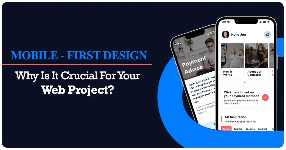
What is A Mobile-First Design?
Mobile-first design is a unique approach of making web-based projects with designs that are focused on giving a great user experience to mobile phone users. Through this strategy, web designers build the design of a website or web app for mobile screens first. This is done by designing the prototype of a web-based project that fits mobile screens first and then going forward with the larger screens.
Mobile-First Design Vs Responsive Design
After understanding what a mobile-first design is, you must be wondering how it is different from a Responsive Design strategy. Below, we have tried to thoroughly lay out the difference between a mobile-first design and a responsive design.
Mobile-first design is an approach to design where the mobile version of a website or application is created first, and then it is adapted to larger screens, such as tablets or desktop computers. The focus is on creating a design that is optimized for small screens and slower internet connections. This approach can help ensure that the most important content and features are prioritized, and that the user experience is optimized for mobile devices.
Responsive design, on the other hand, is an approach where a website or application is designed to adapt to different screen sizes and devices, regardless of the order in which the design is created. The design is flexible and can adjust to different screen sizes, resolutions, and orientations. Responsive design can provide a seamless experience across devices and can help ensure that the content and functionality are accessible and usable on any device.
Benefits Of Mobile-First Design Approach
Mobile-first design approach is a strategy that focuses on designing a website or application for mobile devices first, then scaling it up for larger screens. Now that you are familiar with the mobile-first design approach, it is time to go over the benefits of this strategy.
* Improved User Experience: By prioritizing the design for smaller screens, you can ensure that the site or app is optimized for touch-based interactions, smaller screens, and limited bandwidth. This can result in a better user experience for mobile users, who are increasingly using their phones to access the internet.
* Faster Loading Times: By optimizing for mobile devices first, you can reduce the amount of data that needs to be loaded, resulting in faster load times. This is particularly important for mobile users, who may be on slower connections or have limited data plans.
* Improved Search Engine Ranking: Google has made it clear that mobile-friendliness is a ranking factor. By designing with mobile in mind, you can ensure that your site is optimized for mobile search, which can improve your search engine ranking.
* Future-Proofing: As more and more people use mobile devices to access the internet, designing for mobile first ensures that your site or app will be relevant and usable for years to come.
* Increased Engagement And Conversion: By providing a better user experience for mobile users, you can increase engagement and conversion rates. Mobile users are more likely to interact with and buy from a site or app that is optimized for their device.
Overall, the mobile-first design approach can result in a better user experience, faster load times, improved search engine ranking, future-proofing, and increased engagement and conversion rates.
Key Takeaways
Mobile phones are the future and the future is now. As more and more people get their hands on smartphones, it’s important to get mobile-friendly websites and web applications developed. If you are looking to grow your business extensively, getting a website designed through a mobile-first design approach is a requisite. Mobile–first design approach will bring growth to your business through more leads and conversion. EitBiz is one of the most credible website design companies in the USA. Explore our web designing solutions to enhance your business significantly.